Blue Dental Office: A Complete Guide to Design and Color Psychology
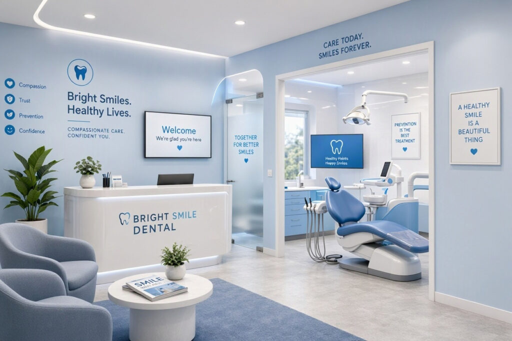
Blue is the most popular color in healthcare design. It is no accident that so many dental offices, hospitals, and medical clinics use blue as their primary color. Blue communicates trust, calm, and professionalism. It reduces anxiety and creates a sense of safety.
But not all blues are created equal. A pale sky blue feels different from a deep navy. The wrong shade can feel cold, institutional, or depressing. The right shade can transform your dental office into a welcoming, reassuring space.
This guide covers everything you need to know about designing a blue dental office. You will learn about the psychology of blue, the best shades for each area, and practical tips for creating a cohesive, beautiful space. By the end, you will know how to use blue effectively to enhance patient experience and strengthen your brand.
Why Blue Is the Ideal Color for Dental Offices
Blue is more than a design trend. It is a strategic choice backed by color psychology and patient research. Here is why blue works so well in dental settings.
- It Calms Anxiety: Blue is associated with calmness and tranquility. It lowers heart rate and reduces stress. This is especially important for nervous dental patients.
- It Builds Trust: Blue is the color of trust and reliability. It is used by banks, hospitals, and technology companies to signal safety and professionalism.
- It Feels Clean and Clinical: Blue is associated with cleanliness and hygiene. It reinforces the clinical standards of your practice.
- It Is Universally Appealing: Unlike some colors, blue is liked by people of all ages and cultures. It is a safe choice for any demographic.
- It Enhances Focus: Blue promotes concentration and mental clarity. This benefits both patients and staff.
- It Is Versatile: Blue comes in hundreds of shades. From soft pastels to deep navies, there is a blue for every design style.
“Blue is the workhorse of healthcare design. It is calming without being boring, professional without being cold. When you choose the right shade, blue can transform a clinical space into a place of comfort.” — Dr. Amanda Reid, Dental Office Design Specialist
The Psychology of Blue: What Each Shade Communicates
Not all blues are the same. Different shades evoke different emotions. Understanding this helps you choose the right blue for each area of your practice.
Light Blues (Sky Blue, Baby Blue)
Light blues are soft, airy, and gentle. They promote relaxation and openness. They are ideal for waiting rooms and operatories where patients need to feel at ease.
- Emotions: Calm, peace, openness, innocence
- Best Use: Waiting rooms, pediatric operatories, ceilings
- Avoid: Large areas, as it can feel washed out
Medium Blues (Cornflower, Cerulean)
Medium blues are balanced and versatile. They are calming but also professional and trustworthy. They work well in almost any area of a dental office.
- Emotions: Trust, reliability, harmony, professionalism
- Best Use: Reception areas, hallways, treatment rooms
- Avoid: Overuse in small spaces, as it can feel monotonous
Deep Blues (Navy, Indigo)
Deep blues are sophisticated and authoritative. They convey strength, confidence, and stability. They are excellent for accent walls and branding elements.
- Emotions: Trust, strength, wisdom, stability
- Best Use: Accent walls, reception desks, branding, team uniforms
- Avoid: Small rooms and ceilings, as it can feel heavy and oppressive
Blue-Greens (Teal, Aqua, Turquoise)
Blue-greens are refreshing and modern. They combine the calm of blue with the healing energy of green. They are perfect for practices that want a contemporary, spa-like feel.
- Emotions: Balance, healing, renewal, sophistication
- Best Use: Operatories, treatment rooms, spa-like areas
- Avoid: Overuse in traditional settings, as it can feel trendy
| Shade | Emotions | Best Use | Avoid |
|---|---|---|---|
| Light Blue | Calm, peace, openness | Waiting rooms, ceilings | Large areas |
| Medium Blue | Trust, professionalism | Reception, hallways | Small spaces |
| Deep Blue | Strength, authority | Accent walls, branding | Small rooms, ceilings |
| Blue-Green | Healing, renewal | Operatories, spa areas | Traditional settings |
Note for Readers: Always test paint samples in your actual space before committing. Colors look different under different lighting conditions. A shade that looks perfect in the store may look completely different in your office.
Best Blue Color Palettes for Dental Offices
A well-designed blue palette uses multiple shades to create depth and interest. Here are some proven palettes for dental practices.
1. The Coastal Palette
- Base: Soft sky blue
- Accent: White, sand beige, soft gray
- Pop of Color: Coral or seafoam green
- Best For: Practices that want a fresh, airy, beach-like feel
2. The Professional Palette
- Base: Medium blue
- Accent: White, charcoal gray, silver
- Pop of Color: Gold or brass fixtures
- Best For: Practices that want a polished, corporate feel
3. The Spa Palette
- Base: Blue-green (teal or aqua)
- Accent: White, light wood tones, natural textures
- Pop of Color: Soft green plants, stone accents
- Best For: Practices that want a calming, wellness-focused atmosphere
4. The Pediatric Palette
- Base: Bright sky blue
- Accent: White, yellow, orange
- Pop of Color: Fun, cartoon-themed accents
- Best For: Pediatric dental offices that want a playful, energetic feel
5. The Modern Palette
- Base: Deep navy blue
- Accent: White, light gray, marble
- Pop of Color: Gold or copper accents
- Best For: High-end, cosmetic practices that want a luxurious feel
Pro Tip: Use the 60-30-10 rule. Choose a dominant color (60%), a secondary color (30%), and an accent color (10%). For a blue office, use blue as the dominant or secondary color, with neutral tones to balance it.
Room-by-Room Blue Application
Different areas of your practice call for different shades and applications of blue. Here is a detailed breakdown.
Reception and Waiting Room
The waiting room is where patients form their first impression. Blue is an excellent choice here.
- Walls: Light or medium blue. Keeps the space feeling open and calm.
- Reception Desk: A deep blue accent. Creates a focal point and adds sophistication.
- Furniture: Neutral tones (gray, beige, white) with blue accent pillows or upholstery.
- Artwork: Blue-toned landscapes or abstract art.
- Lighting: Warm white LED (3000K-3500K) to soften the blue.
Operatories and Treatment Rooms
Operatories require a careful balance of calm and clinical precision.
- Walls: Light blue or blue-green. Promotes relaxation without interfering with clinical work.
- Ceiling: Light blue or white. A blue ceiling can be calming for patients looking up during procedures.
- Cabinetry: White or light gray. Keeps the space clean and clinical.
- Accents: Blue-green or teal. Adds a spa-like touch.
- Lighting: Neutral white LED (3500K-4000K) with high CRI for accurate color rendering.
Hallways and Corridors
Hallways are transitional spaces. They should be calming and easy to navigate.
- Walls: Medium blue or soft blue-green. Creates a cohesive flow.
- Flooring: Neutral tones that complement the blue.
- Signage: White or silver on blue backgrounds for high contrast.
- Artwork: Blue-toned nature photography or abstract pieces.
Front Office and Business Area
The front office is where your team works. Lighting and color should support focus and comfort.
- Walls: Medium blue or gray-blue. Professional and calming.
- Desks: White or light wood. Keeps the space bright.
- Accents: Blue branding elements, branded office supplies.
- Lighting: Neutral white LED (3500K-4000K) for task lighting.
| Area | Best Blue Shade | Why |
|---|---|---|
| Reception | Light to medium blue | Calming, welcoming |
| Operatories | Light blue or blue-green | Relaxing, clinical |
| Hallways | Medium blue | Cohesive, calming |
| Front Office | Gray-blue | Professional, focused |
| Restrooms | Light blue | Fresh, clean |
Important Note: Avoid using deep blue in small spaces or on ceilings. It can feel heavy and oppressive. Use deep blue as an accent color instead.
Blue in Branding and Marketing
Blue is a powerful branding color. It should be used consistently across all your marketing materials.
1. Logo and Visual Identity
If blue is your brand color, use it prominently in your logo. Choose a shade that is distinctive and recognizable. Use it consistently across your website, business cards, and signage.
2. Website Design
Use blue as a primary or accent color on your website. Blue buttons and call-to-action elements are highly effective. They are associated with trust and reliability.
3. Social Media
Create branded graphics with blue backgrounds. Use consistent colors and fonts to build recognition. Blue quotes, tips, and team photos all reinforce your brand identity.
4. Printed Materials
Use blue in your brochures, patient forms, and appointment cards. Consistent color use builds trust and professionalism.
5. Team Uniforms
Blue scrubs or polo shirts reinforce your brand and create a cohesive team appearance. Blue is a popular choice for healthcare uniforms because it is calming and professional.
“Blue branding is not just about aesthetics. It is about communicating your values. When patients see your blue logo, they should immediately feel trust and calm. Consistency is the key to building that association.” — David Park, Brand Strategist
Blue vs. Other Colors: A Comparison
How does blue compare to other popular dental office colors? Here is a quick comparison.
| Color | Effect | Best Use | Drawbacks |
|---|---|---|---|
| Blue | Calm, trust, professionalism | All areas | Can feel cold if overused |
| Green | Healing, nature, balance | Operatories, waiting rooms | Can feel clinical if too pale |
| Beige | Warm, welcoming, neutral | Waiting rooms, hallways | Can feel boring if overused |
| Gray | Modern, sophisticated, clean | Reception, front office | Can feel sterile if too dark |
| White | Clean, bright, clinical | Any area | Can feel cold and institutional |
Note for Readers: Blue pairs beautifully with many colors. Consider combining blue with warm wood tones, soft whites, and natural textures to avoid a cold, institutional feel.
Common Mistakes to Avoid
Even a beautiful color can go wrong. Here are the most common mistakes when designing a blue dental office.
- Using the Wrong Shade: A shade that is too dark or too bright can increase anxiety. Test samples in your space.
- Overusing Blue: Too much blue can feel cold and monotonous. Balance it with warm neutrals and textures.
- Ignoring Lighting: Blue looks different under different lighting. Test your chosen shade under your office lights.
- Forgetting Contrast: Blue walls with blue furniture can feel flat. Add contrast with white, gray, or wood tones.
- Neglecting the Ceiling: Patients look at the ceiling during procedures. Paint it a light blue or white for a calming effect.
- Skipping Accents: Blue alone can feel cold. Add warm accents like wood, plants, and soft textiles.
“The most common mistake I see is overusing blue. A room that is entirely blue feels cold and clinical. The magic happens when you pair blue with warm, natural elements.” — Sarah Mitchell, Healthcare Interior Designer
Frequently Asked Questions
What is the best shade of blue for a dental office?
Light to medium blues are the safest choices for walls. Deep blues work well as accent colors. Blue-green shades are excellent for a spa-like feel. Always test samples in your space.
Does blue really reduce patient anxiety?
Yes. Research shows that blue lowers heart rate and promotes calmness. It is widely used in healthcare design for this reason. The right shade can make a real difference in patient comfort.
Can I use blue in a pediatric dental office?
Absolutely. Bright, playful blues work well for children. Pair blue with fun colors like yellow, orange, and green. Use cartoon-themed accents and cheerful artwork.
What colors pair well with blue in a dental office?
White, gray, beige, and light wood tones are excellent neutral partners. For accent colors, consider coral, seafoam green, or gold. Avoid pairing blue with other cool colors, which can feel cold.
How do I prevent a blue office from feeling cold?
Add warm elements like wood furniture, soft textiles, plants, and warm lighting. Use warm white bulbs (3000K-3500K) instead of cool white. Incorporate textures like rugs, curtains, and upholstery.
Should I paint my ceiling blue?
A light blue ceiling can be calming for patients looking up during procedures. However, avoid deep blue on ceilings, which can feel heavy and oppressive. Test it in one room first.
Conclusion
A blue dental office is a strategic design choice that calms patients, builds trust, and reinforces your professional brand. By choosing the right shades, balancing with warm neutrals, and applying blue thoughtfully across each area, you can create a space that feels both clinical and comforting.
Additional Resource
For more guidance on color psychology in healthcare design, explore the resources from the Pantone Color Institute. https://www.pantone.com/color-intelligence