Colorful Dental Office: How to Use Color to Energize, Calm, and Delight Patients
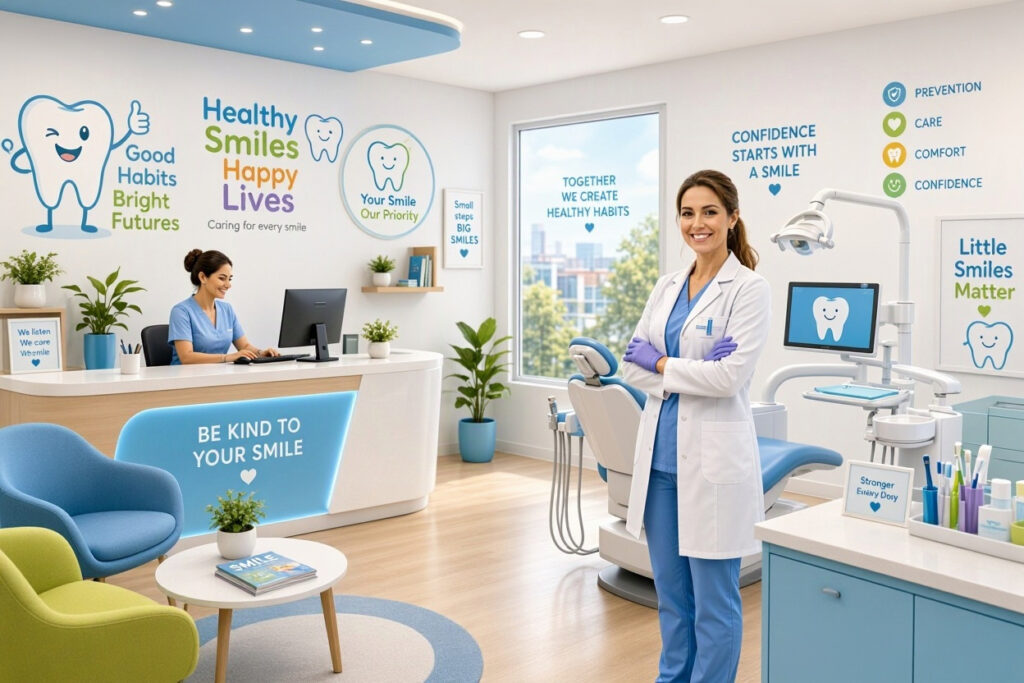
Walk into a colorful dental office and something shifts. The space feels alive, welcoming, and human. Color is one of the most powerful tools in interior design. It influences mood, energy, and even how patients perceive the quality of your care. But using color well takes intention. Too little feels clinical. Too much feels chaotic. This guide explains how to design a colorful dental office that balances vibrancy with professionalism.
Why Color Matters in a Dental Office
Color affects people before they think about it. Warm colors energize. Cool colors calm. Bright colors excite. Muted colors soothe. In a dental office, those effects matter because patients often arrive anxious.
Color also communicates brand identity. A pediatric practice with bright, playful colors feels different from a cosmetic clinic with elegant, muted tones. Both can be colorful, but they use color differently.
“Color is the fastest way to change how a room feels. It works before a patient reads a single sign.” — Color Psychology Researcher
Key Benefits of Colorful Design
- Anxiety reduction: The right colors calm nervous patients.
- Mood elevation: Bright accents lift spirits and energy.
- Brand recognition: A consistent palette makes you memorable.
- Wayfinding: Color helps patients navigate your office.
- Child engagement: Bright colors appeal to young patients.
Understanding Color Psychology
Different colors produce different responses. Understanding these effects helps you choose wisely.
Color Effects at a Glance
| Color | Emotional Effect | Best Use in Dental Office | Caution |
|---|---|---|---|
| Blue | Calm, trustworthy | Treatment rooms, waiting areas | Can feel cold if overused |
| Green | Soothing, natural | Waiting rooms, hallways | Needs warm accents |
| Yellow | Cheerful, optimistic | Kids’ areas, accents | Overpowering in large doses |
| Orange | Warm, energetic | Reception, play areas | Can feel aggressive if too bright |
| Coral | Friendly, approachable | Reception, waiting room | Use as accent, not base |
| Teal | Fresh, balanced | All areas | Trendy but may date |
| Purple | Imaginative, calming | Kids’ areas, accents | Can feel heavy in large areas |
| Red | Energizing, urgent | Small accents only | Raises heart rate, avoid large areas |
Tip: Use bold colors as accents, not as the base. A room with too much bright color feels chaotic. A room with a neutral base and colorful accents feels balanced.
The 60-30-10 Rule for Colorful Offices
This classic design rule keeps colorful spaces balanced.
- 60% dominant color: Usually a neutral like white, cream, or soft gray.
- 30% secondary color: A complementary tone like teal, sage, or soft blue.
- 10% accent color: A bold pop like coral, mustard, or bright yellow.
Example Palettes
| Palette Name | 60% Base | 30% Secondary | 10% Accent |
|---|---|---|---|
| Fresh and friendly | Warm white | Teal | Coral |
| Natural calm | Cream | Sage green | Mustard yellow |
| Playful pediatric | Soft blue | Bright yellow | Orange |
| Modern bright | Light gray | Navy blue | Lime green |
| Warm welcome | Off-white | Terracotta | Deep teal |
Note: Test your palette in your actual lighting. Colors look different under fluorescent, LED, and natural light.
Colorful Design for Pediatric Offices
Children respond strongly to color. A colorful pediatric office can turn fear into excitement.
Color Ideas for Kids
- Bright primary colors: Red, blue, and yellow in play areas.
- Rainbow accents: A rainbow wall or ceiling feature.
- Colorful murals: Friendly characters and scenes.
- Bright furniture: Chairs and tables in cheerful hues.
- Colorful flooring: Checkerboard or patterned tiles.
Important Note: Avoid overwhelming children with too many colors at once. Use one or two bright colors per zone and keep the overall palette organized.
Colorful Design for Adult Practices
Adult-focused practices can use color too, but with more restraint.
Color Ideas for Adults
- Deep jewel tones: Emerald, sapphire, and amethyst as accents.
- Muted pastels: Soft blush, sage, and powder blue.
- Bold accent walls: One dramatic color behind the reception desk.
- Colorful artwork: Vibrant pieces that draw the eye.
- Upholstered furniture: Chairs in rich, warm colors.
Tip: Use color to guide patients through the office. A bright accent wall at the end of a hallway draws people forward.
Colorful Treatment Rooms
Treatment rooms need calm, but that does not mean beige. Color can be used thoughtfully.
Ideas for Treatment Rooms
- Soft blue or green walls: Calming and clinical-friendly.
- A colorful accent wall: One wall in a muted but interesting tone.
- Ceiling art: Colorful decals or murals above the chair.
- Colorful chair upholstery: A bright chair can lift the room.
- Colorful storage bins: Functional and fun.
Important Note: Keep colors in treatment rooms muted. Bright, saturated colors can overstimulate anxious patients.
Colorful Waiting Rooms
The waiting room is where color has the biggest impact. It is where patients sit and look around.
Waiting Room Color Ideas
- A colorful accent wall: One wall in a bold brand color.
- Colorful seating: Chairs in mixed but coordinated colors.
- Bright throw pillows: Easy to change with the seasons.
- Colorful artwork: Large, vibrant pieces.
- A colorful kids’ corner: Bright rugs, toys, and furniture.
Using Color for Wayfinding
Color can help patients navigate your office without confusion.
Wayfinding Ideas
- Color-coded hallways: Different colors for different areas.
- Colorful door frames: Each treatment room has a colored frame.
- Colorful signage: Signs in brand colors that stand out.
- Floor decals: Colored lines leading to key areas.
Tip: Keep wayfinding colors consistent. If blue means “treatment rooms,” use blue everywhere for that purpose.
Budgeting for a Colorful Office
Color does not have to be expensive. Paint and accents deliver the biggest impact for the lowest cost.
| Project | Typical Cost | Impact |
|---|---|---|
| Accent wall paint | $200 – $600 | High |
| Colorful throw pillows | $50 – $150 | Medium |
| Artwork | $200 – $1,000 | High |
| Colorful seating | $500 – $3,000 | High |
| Wall decals | $50 – $300 | Medium |
| Colorful storage bins | $50 – $200 | Medium |
Tip: Start with paint. A single accent wall changes the whole feel of a room for a few hundred dollars.
Common Mistakes to Avoid
- Too many colors: Creates visual chaos and stress.
- Ignoring lighting: Colors look different under office lights.
- Forgetting the brand: Colors should match your identity.
- Overdoing bright colors: They can increase anxiety.
- No testing: Always test paint samples before committing.
Frequently Asked Questions
What colors are best for a dental office?
Soft blues, greens, and warm neutrals calm patients. Bright colors work as accents, especially in kids’ areas.
Is a colorful dental office unprofessional?
Not if the palette is balanced. Use the 60-30-10 rule and keep bold colors as accents.
How do I choose a color palette for my dental office?
Start with a neutral base, add a secondary color that matches your brand, and finish with one accent color. Test samples in your actual lighting.
Can I use bright colors in treatment rooms?
Use muted or soft colors in treatment rooms. Bright, saturated colors can overstimulate anxious patients.
How much does it cost to make a dental office colorful?
Paint and accents cost a few hundred dollars. Full updates with furniture and artwork range from $1,000 to $5,000.
Additional Resource
For color inspiration and palette tools, visit Sherwin-Williams ColorSnap for visualizer tools and designer palettes.
Conclusion
A colorful dental office can energize patients, calm anxiety, and reinforce your brand. Use color psychology, follow the 60-30-10 rule, and keep bold colors as accents. Test your palette in real lighting and match colors to your identity. With thoughtful choices, color transforms your practice into a space patients enjoy visiting.