Dental Office Bulletin Board Ideas: Inform, Engage, and Reassure
A bulletin board is one of the humblest items in a dental office. It costs very little, takes an afternoon to install, and rarely appears in design magazines. Yet a well-run board quietly does something valuable: it gives waiting patients something useful to read, shows that your practice is active and thoughtful, and turns dead time into a small moment of connection.
This guide covers practical dental office bulletin board ideas you can actually implement—content that works, layouts that read well from a distance, seasonal rotation schedules, and the maintenance habits that keep a board from becoming visual clutter.
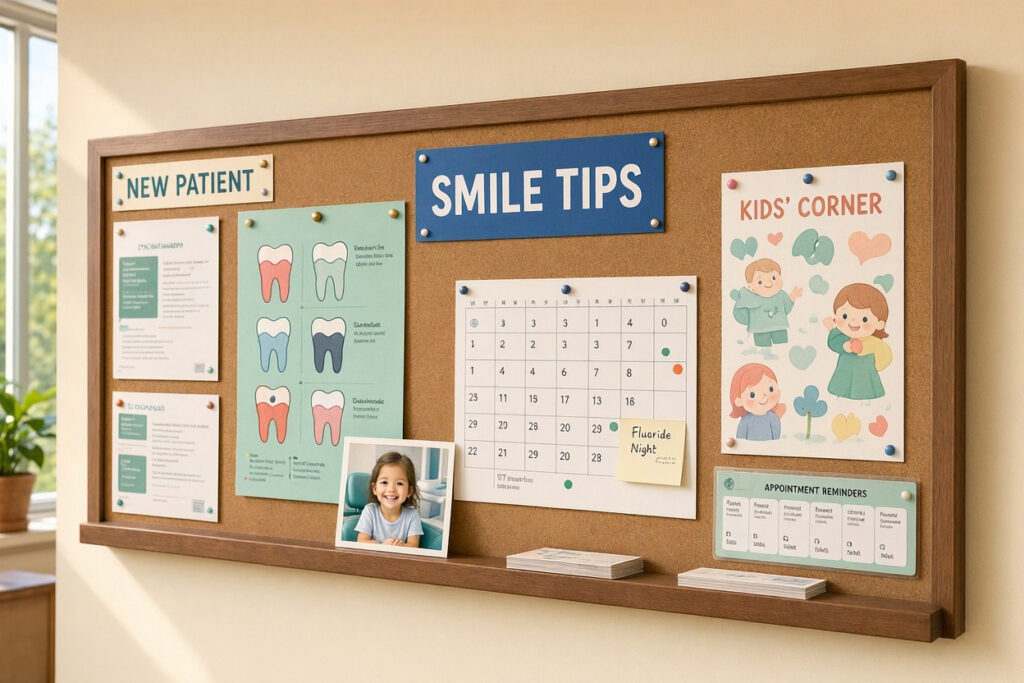
What a Bulletin Board Is Actually For
Before pinning anything up, be clear about the board’s job. A board that tries to do everything does nothing well.
Four Legitimate Purposes
- Patient education: Simple, useful information about oral health, prevention, and treatment.
- Practice communication: Hours, new services, team introductions, policy updates.
- Engagement: Contests, seasonal activities, and community news that give patients something to talk about.
- Reassurance: Friendly, human content that makes the practice feel approachable rather than institutional.
One Purpose Per Board
If you have space for more than one board, assign each a distinct role. A single board crammed with education, promotions, and seasonal decor becomes noise. A board with a clear theme gets read.
“Our education board gets far more attention than our promotional one. Patients actually read the ‘How often should you change your toothbrush?’ post. Nobody reads the insurance reminders.” — Nicole Tran, Dental Office Manager
Choosing the Right Location and Format
Placement determines whether a board gets noticed at all.
| Location | Traffic Level | Best Use |
|---|---|---|
| Waiting area, facing seating | Highest | Education and engagement content |
| Near the check-out desk | High | Practice updates, next-appointment reminders |
| Corridor to treatment rooms | Moderate | Seasonal themes, team features |
| Children’s corner | High (for families) | Kids’ activities, contests, coloring displays |
| Staff room | Internal only | Team recognition and internal notices |
Format Considerations
- Framed cork board: Classic, easy to update, inexpensive.
- Magnetic board: Cleaner look, holds printed sheets with magnets.
- Fabric-covered board: Softer appearance, suits warm interior palettes.
- Glass or acrylic dry-erase board: Modern and easy to wipe, but requires careful handwriting.
- Digital display screen: Not a bulletin board in the traditional sense, but worth considering for rotating content. See the digital section below.
Size matters more than most practices expect. A board smaller than roughly 24 by 36 inches gets lost on a wall. If the wall is large, go bigger rather than adding several small boards.
Content Ideas That Patients Actually Read
The most common failure is content written for the practice rather than the patient. Here’s what works.
Education Content That Earns Attention
- Short, specific questions: “Should you brush before or after breakfast?” beats “Oral Hygiene Tips.”
- Myth vs. fact format: Two columns with a common belief and the accurate answer.
- Simple visuals: A diagram of proper brushing angles or flossing technique.
- Seasonal health notes: Cold and flu season reminders about replacing toothbrushes.
- Age-specific guidance: What to expect at a first visit, or dental care during pregnancy.
- Infographics from reputable sources: ADA or CDC materials, clearly credited.
Engagement Content
- Patient of the month: With written permission, featuring a child who had a great visit.
- Brushing chart challenge: A printable chart families can take home.
- Guess-the-number contests: Simple, cheap, and popular with children.
- Staff Q&A: “Meet the hygienist” with three light questions and answers.
- Local community news: School events, charity drives, neighborhood updates.
- Photo wall: Team photos, office events, or community involvement pictures.
Practice Communication
- New services or technology: A short explanation of a new scanner or treatment.
- Team introductions: Photos and short bios of new staff members.
- Policy reminders: Cancellation policy, insurance accepted, payment options.
- Hours and holiday closures: Clear and prominently placed.
- Patient portal or online booking instructions: A simple step-by-step graphic.
Layout Principles for Readability
A board is read from several feet away, often while standing or half-distracted. Design accordingly.
Practical Layout Rules
- One headline: A single bold title tells viewers what the board is about.
- Three to five items maximum: More than that and nothing gets read.
- Large type: Body text should be readable from at least four feet away.
- Plenty of white space: Gaps between items make the board look organized.
- Consistent borders: Matching paper or border styles create cohesion.
- A clear reading path: Arrange items in a Z or F pattern rather than scattered randomly.
- Straight pins and clean edges: Crooked papers look careless.
Typography Basics
| Element | Recommendation | Why It Matters |
|---|---|---|
| Headline | 72pt or larger, bold | Readable from across the room |
| Subheadings | 36–48pt | Guides the eye |
| Body text | 18–24pt minimum | Readable standing several feet away |
| Font style | One clean sans-serif family | Mixed fonts look cluttered |
| Contrast | Dark text on light background | Improves legibility under office lighting |
Seasonal Rotation Calendar
A board that never changes stops being read. Plan a rotation so the board always feels current.
| Season | Theme Ideas | Content Focus |
|---|---|---|
| Winter | New year, healthy habits | Resolution tips, brushing routines, cold-season oral care |
| Spring | Fresh start, spring cleaning | Replace your toothbrush, allergy and dry mouth tips |
| Summer | Hydration and summer smiles | Sports mouthguards, sugary drink awareness, travel dental tips |
| Fall | Back to school, harvest | Lunchbox ideas, kids’ brushing charts, pumpkin-themed activities |
| Holidays | Inclusive seasonal celebration | Team photos, thank-you notes, community giving |
Keep holiday content inclusive and avoid any single religious tradition. If you display Halloween content, keep it friendly rather than spooky—our guide on dental office Halloween decorations covers appropriate seasonal choices.
Involving Patients and the Community
The best boards are not written solely by staff.
Engagement Ideas
- Children’s art display: Rotate drawings from young patients, with parental permission. This is consistently one of the most popular board features in family practices.
- Photo submissions: A seasonal photo contest with small prizes.
- Question of the month: Post a question and display patient answers (with consent).
- School partnerships: Display artwork or announcements from a local school.
- Charity collection: A small note about a food or toy drive with drop-off details.
Consent and Privacy
Never post a patient’s name, photo, or treatment details without written permission. For children, obtain permission from a parent or guardian. Keep first names only where display is appropriate, and never include clinical information.
“We display children’s drawings with a small permission slip parents sign at check-in. It’s become a favorite feature—kids bring in new drawings specifically to be pinned up.” — Dr. Simon Adebayo, DDS
Maintenance and Hygiene
A bulletin board in a healthcare setting needs basic care.
- Dust the surface weekly: Wipe frames and board surfaces during regular cleaning.
- Refresh faded papers: Sunlight fades print quickly. Replace yellowed or curled pages.
- Check pins and magnets: Loose items fall and create hazards on the floor.
- Remove outdated content promptly: Expired promotions and past events undermine credibility.
- Keep it out of clinical zones: Boards belong in waiting and corridor areas, not treatment rooms where they cannot be cleaned adequately.
- Audit monthly: A five-minute review prevents slow decline into clutter.
Digital Alternatives Worth Considering
A screen is not a bulletin board, but it solves some of the same problems.
| Format | Strengths | Limitations |
|---|---|---|
| Traditional board | Cheap, tactile, easy to update | Requires physical maintenance, fades |
| Digital screen | Rotating content, no printing, modern look | Higher cost, needs content management, feels impersonal |
| Hybrid approach | Board for children’s art and tactile content; screen for rotating information | Requires managing two systems |
Screens work best when content is genuinely updated. A screen showing the same loop for six months looks worse than a well-maintained cork board.
Common Bulletin Board Mistakes
| Mistake | Why It’s a Problem | Better Approach |
|---|---|---|
| Too many items | Nothing gets read | Limit to three to five pieces |
| Tiny text | Unreadable from seating | Use 18–24pt body text minimum |
| Outdated content | Signals neglect | Rotate monthly |
| Clinical or graphic images | Increases patient anxiety | Use friendly, simple visuals |
| Promotional overload | Feels like advertising | Balance education and engagement |
| Crooked, curling papers | Looks careless | Refresh and straighten regularly |
| Board placed out of sight | Never read | Face the seating area |
An FAQ on Dental Office Bulletin Boards
1. What should I put on a dental office bulletin board?
Focus on three to five items: one educational piece, one engagement item, and one practice update. Keep text large, use a single clear headline, and refresh content monthly.
2. Where is the best place for a bulletin board in a dental office?
The waiting area, facing the seating, gets the most attention. A second board near check-out works well for practice updates and next-appointment reminders.
3. How often should a dental office bulletin board be updated?
Rotate content monthly or at minimum seasonally. Remove outdated items immediately. A monthly five-minute audit prevents the board from looking neglected.
4. Is it appropriate to display children’s artwork on a dental office bulletin board?
Yes, with written permission from a parent or guardian. Use first names only and never include clinical information. Children’s art is consistently one of the most engaging board features.
5. Should I use a digital screen instead of a bulletin board?
A screen works well if you can commit to updating content regularly. Many practices use both—a traditional board for tactile content like children’s art and a screen for rotating information.
6. How do I keep a bulletin board hygienic in a dental office?
Wipe the board and frame weekly, replace curled or faded papers, and keep the board out of clinical areas. Choose smooth surfaces that can be cleaned easily.
7. What content should I avoid on a dental office bulletin board?
Avoid graphic clinical images, fear-based messaging, excessive promotional content, and anything requiring more than a few seconds to read. Also avoid sensitive or religiously specific holiday content.
Important Note for Readers
Always obtain written consent before displaying patient photos, names, or children’s artwork. Confirm that any printed health information comes from reputable sources such as the ADA or CDC, and credit it clearly. Check with your landlord before mounting boards on rented walls, and keep all displays out of accessible pathways.
Conclusion
A dental office bulletin board is a small investment that pays back in patient engagement and trust.
Clear purpose and disciplined content make a board genuinely readable.
Seasonal rotation and patient contributions keep it fresh and interesting.
Consistent maintenance prevents a helpful display from becoming clutter.
Additional Resource: For patient-friendly oral health materials suitable for display, visit the ADA’s MouthHealthy site. https://www.mouthhealthy.org/