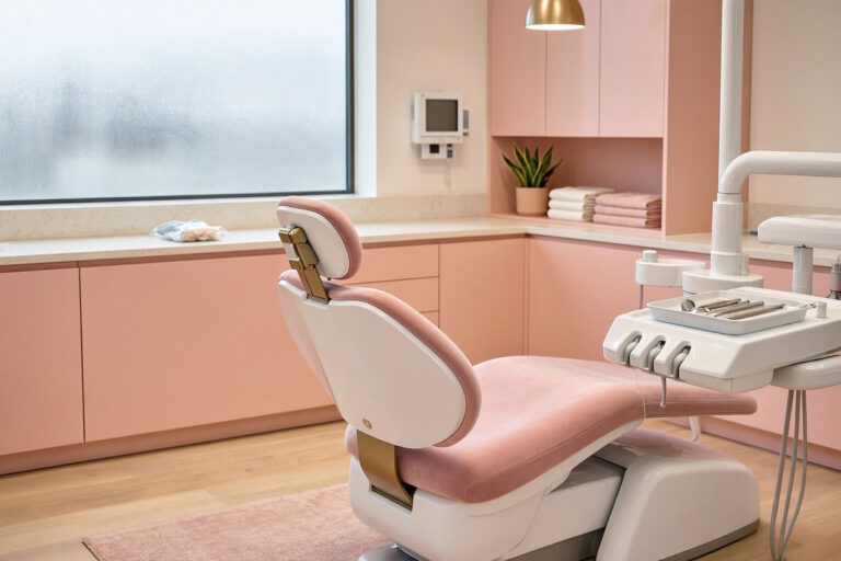
Dental Office Color Schemes: Choosing Palettes That Calm and Reassure
Color is the cheapest renovation available. A can of paint costs a fraction of new furniture, yet it changes how a room feels more than almost any other design decision. In a dental office, where patients arrive anxious and spend time staring at walls and ceilings, color does real work. The right dental office color schemes lower stress, signal cleanliness, and make your practice feel considered. The wrong ones make a small room feel cramped and a nervous patient feel worse.
This guide covers practical palettes, room-by-room choices, finish selection, and how to test colors before committing. It’s written for practice owners and managers who want decisions they can defend, not vague advice about “calming tones.”
How Color Actually Affects Patients
Color psychology is often oversold, but some effects are well established and worth using.
Arousal and Calm
Warm, saturated colors—bright reds, oranges, and yellows—raise arousal. That’s useful in a fast-food restaurant and unhelpful in a dental waiting room. Cool and muted colors lower arousal, which is exactly what anxious patients need.
Perceived Cleanliness
Light, cool tones read as clean and clinical. Blues and greens in particular signal hygiene in healthcare settings, which builds trust before treatment begins.
Perceived Space
Light colors reflect light and make rooms feel larger. Dark colors absorb light and shrink a space visually. In a compact operatory, this difference is significant.
Cultural Associations
Color meanings vary by culture. White signals purity in many Western contexts but can signal mourning elsewhere. Blue is broadly calming but reads as cold in some settings. Neutral palettes are the safest choice for diverse patient populations.
“We repainted our waiting room from a bold orange to a soft sage. Patient comments shifted from ‘it’s very… bright’ to ‘it feels so relaxing in here.’ Same room, same furniture, different paint.” — Dr. Lauren Whitaker, DDS
The Core Palette Families
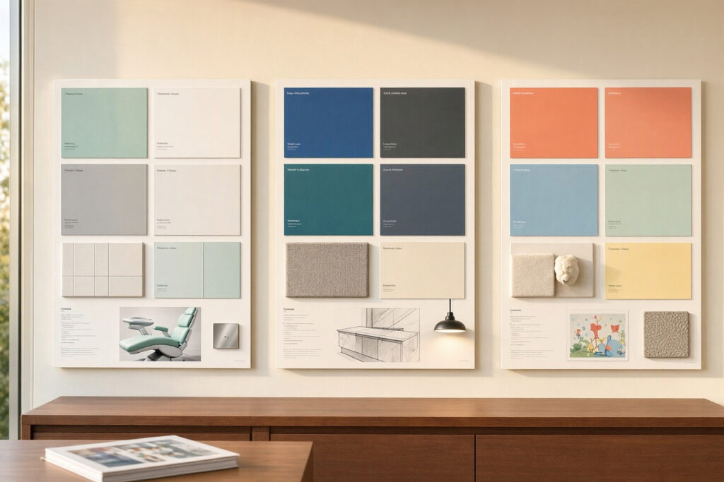
Most successful dental office palettes fall into a few reliable families. Each has strengths and trade-offs.
| Palette Family | Core Colors | Effect | Best For |
|---|---|---|---|
| Coastal Calm | Soft blue, pale gray, white, sandy beige | Serene, clean, trustworthy | General practices, waiting areas |
| Botanical | Sage green, warm white, natural wood tones, soft charcoal | Grounding, natural, restorative | Family practices, wellness-focused brands |
| Warm Neutral | Greige, taupe, cream, warm gray, soft bronze accents | Inviting, sophisticated, non-clinical | Boutique and cosmetic practices |
| Modern Cool | Light gray, white, navy accent, brushed metal | Sleek, professional, contemporary | Urban practices, tech-forward brands |
| Gentle Pastel | Muted lavender, soft mint, blush, cream | Soft, friendly, approachable | Pediatric and family practices |
Accent Discipline
A common mistake is adding too many accent colors. Choose one accent and use it deliberately—on a single wall, on cabinetry handles, in artwork, or in upholstery. Two accents maximum. Beyond that, rooms start to feel busy rather than designed.
Room-by-Room Color Guidance
Different rooms serve different purposes. Color should follow function.
| Room | Recommended Palette | Avoid | Reasoning |
|---|---|---|---|
| Waiting area | Soft blue, sage, warm neutral | Bright reds, intense yellows | Patients sit here anxious; low arousal helps |
| Reception desk wall | Brand color or deep accent | Clashing brights | Creates a focal point and reinforces brand |
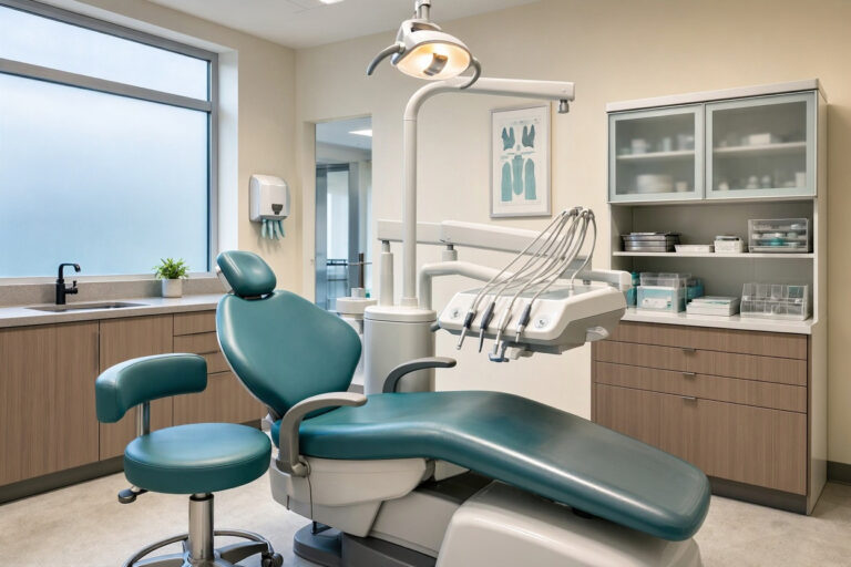
| Treatment rooms | Soft neutral, pale green, muted blue | Dark colors, busy patterns | Patients stare at these walls while reclined |
| Treatment room ceiling | Very light neutral or soft sky tone | Dark or patterned surfaces | The most-viewed surface in the practice |
| Corridors | Light neutral with one accent | Very dark colors | Narrow spaces need reflected light |
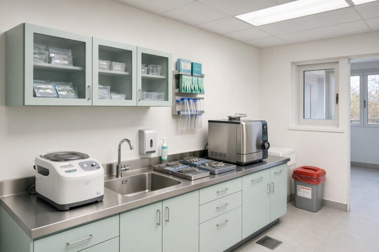
| Sterilization room | White, light gray, stainless | Warm or dark tones | Hygiene perception and stain visibility |
| Staff break room | Warmer tones, wood accents | Clinical whites | Staff need a visual break from clinical cues |
| Children’s area | Muted brights, playful accents | Overstimulating primary colors | Fun without chaos |
Working With Your Brand Colors
Your palette should connect to your logo and marketing materials, not compete with them.
Practical Steps
- Start with your logo. Identify two or three colors in it that could work as accents.
- Choose a neutral base. Walls, ceilings, and large surfaces should be neutral or near-neutral.
- Use brand colors as accents. A navy accent wall or teal cabinetry handles reads as intentional.
- Match marketing materials. If your website and brochures use one palette, the office should echo it.
- Test brand colors in context. A color that works on a screen may feel intense across an entire wall.
Finishes Matter as Much as Color
Paint finish affects durability, cleanability, and how color appears.
| Finish | Sheen Level | Best Use | Notes |
|---|---|---|---|
| Flat / Matte | Lowest | Ceilings, low-traffic accent walls | Hides imperfections but hard to clean |
| Eggshell | Low | Waiting areas, corridors, offices | Good balance of cleanability and appearance |
| Satin | Medium | Treatment rooms, high-traffic walls | Wipeable and durable |
| Semi-gloss | High | Reception, door frames, trim | Very cleanable, shows wall imperfections |
| High-gloss | Highest | Accent trim, cabinetry | Durable but reflective; use sparingly |
For clinical areas, satin or semi-gloss is the practical choice. They withstand frequent wiping and resist staining. Flat paint in treatment rooms looks elegant for about three months, then shows every scuff.
Low-VOC and Zero-VOC Paints
Choose low-VOC or zero-VOC paints, especially in clinical spaces. Odor and chemical emissions matter in a healthcare environment, and low-VOC options now perform as well as conventional paints. Allow proper curing time before patients return to the space.
Testing Colors Before You Commit
Paint swatches lie. A color that looks perfect in the store can look entirely different on your wall under your lighting.
A Reliable Testing Process
- Paint large samples. Apply two coats on at least two square feet of the actual wall.
- View at different times. Check the sample in morning, midday, and evening light.
- Check under your actual fixtures. Fluorescent, LED, and daylight all shift color temperature.
- Look at it from the patient’s position. Sit in the dental chair and look at the wall as a patient would.
- Compare against fixed elements. Hold fabric, flooring, and cabinet samples next to the painted patch.
- Live with it for a few days. Fresh paint impressions change quickly.
“We tested four greens on the treatment room wall. Two looked identical on the swatch card but completely different once painted. Testing on the actual wall saved us from a very expensive mistake.” — Owen Barrett, Facilities Manager
Common Color Mistakes in Dental Offices
| Mistake | Why It’s a Problem | Better Approach |
|---|---|---|
| All-white everywhere | Feels institutional and cold | Add warm neutrals or a soft accent |
| Too many accent colors | Creates visual chaos | Limit to one or two accents |
| Bright saturated walls in treatment rooms | Increases arousal and anxiety | Use soft, muted tones |
| Dark colors in small rooms | Shrinks the space visually | Choose light, reflective tones |
| Ignoring lighting | Color shifts under different bulbs | Test under your actual fixtures |
| Skipping the ceiling | Patients stare at it constantly | Paint ceilings a soft, clean tone |
| Clashing with brand colors | Feels incoherent | Derive the palette from your brand |
| Flat paint in clinical areas | Can’t be cleaned properly | Use satin or semi-gloss |
Budget and Practicality
Repainting is one of the best-value updates available to a practice.
- Prioritize patient-facing areas. Waiting areas and treatment rooms deliver the most impact per dollar.
- Paint ceilings while you’re at it. It’s often neglected and cheap to include.
- Choose quality paint. Cheaper paint needs more coats and wears faster, erasing the savings.
- Consider professional application for clinical areas. Poor prep shows in high-traffic spaces.
- Plan around the schedule. Paint during closed days or a planned closure to avoid fumes and disruption.
- Keep touch-up paint on hand. Label cans by room for quick repairs.
An FAQ on Dental Office Color Schemes
1. What is the best color for a dental office?
Soft blue, sage green, and warm neutrals are consistently reliable. They lower arousal, read as clean, and work with most brand colors. The best choice depends on your lighting, room size, and brand palette.
2. What colors should I avoid in a dental office?
Avoid bright saturated reds, oranges, and yellows in large areas. Avoid very dark colors in small rooms. Avoid busy patterns that create visual noise, especially in treatment rooms.
3. Should treatment rooms be a different color from the waiting area?
They can be, but they should coordinate. Carry the same base neutral throughout and vary the accent. Treatment rooms generally need simpler, more muted tones since patients spend time staring at those walls.
4. What color should I paint the ceiling in a dental office?
A very light neutral, soft white, or pale sky tone. Patients look at the ceiling constantly while reclined. A dark or patterned ceiling feels oppressive and draws unwanted attention.
5. How many colors should a dental office palette have?
Three to four total: a dominant neutral, a secondary neutral, one accent, and optionally a trim color. More than that tends to look chaotic rather than designed.
6. Does paint finish really matter in a dental office?
Yes. Satin or semi-gloss finishes withstand frequent cleaning and resist staining in clinical areas. Flat paint looks good briefly but wears poorly under daily disinfection.
7. How do I make a small dental office feel bigger with color?
Use light, reflective colors on walls and ceilings, keep the palette consistent between adjacent rooms, and use one deeper accent to add depth without shrinking the space.
Important Note for Readers
Verify that your chosen paints are compatible with the disinfectants your team uses daily, and confirm low-VOC or zero-VOC options meet local regulations. Allow full curing time before patients occupy repainted clinical spaces. Check with your landlord before repainting if you rent, and keep labeled touch-up cans for each room.
Conclusion
Dental office color schemes do quiet, constant work on patient anxiety and perception.
Soft, muted palettes lower arousal and make clinical spaces feel calm and clean.
Room-by-room choices and disciplined accents keep the practice cohesive rather than chaotic.
Testing colors on real walls under real lighting prevents expensive mistakes.
Additional Resource: For guidance on color and lighting in healthcare environments, visit The Center for Health Design. https://www.healthdesign.org/