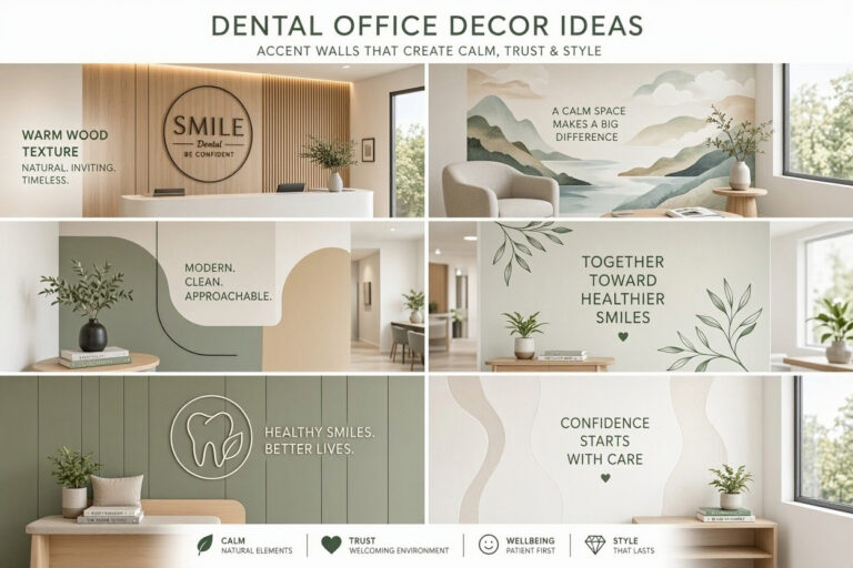
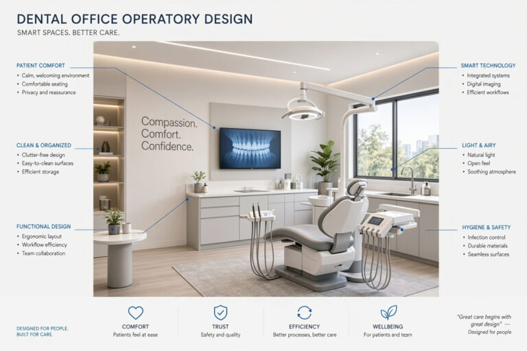
Dental Office Paint Colors: A Complete Guide to Choosing the Right Palette
Paint is one of the most powerful and affordable design tools in your dental office. The right colors calm anxious patients, boost team morale, and reinforce your brand. The wrong colors increase stress, feel clinical, or simply look unprofessional.
Many practice owners default to plain white. It is safe and easy. But white walls can feel cold and institutional. Patients already associate dental visits with anxiety. A sterile environment makes it worse. A thoughtfully chosen palette transforms your office into a welcoming, healing space.
This guide covers everything you need to know about dental office paint colors. You will learn about color psychology, the best shades for each room, paint finishes, and practical tips for application. By the end, you will have a clear plan to choose colors that work for your practice.
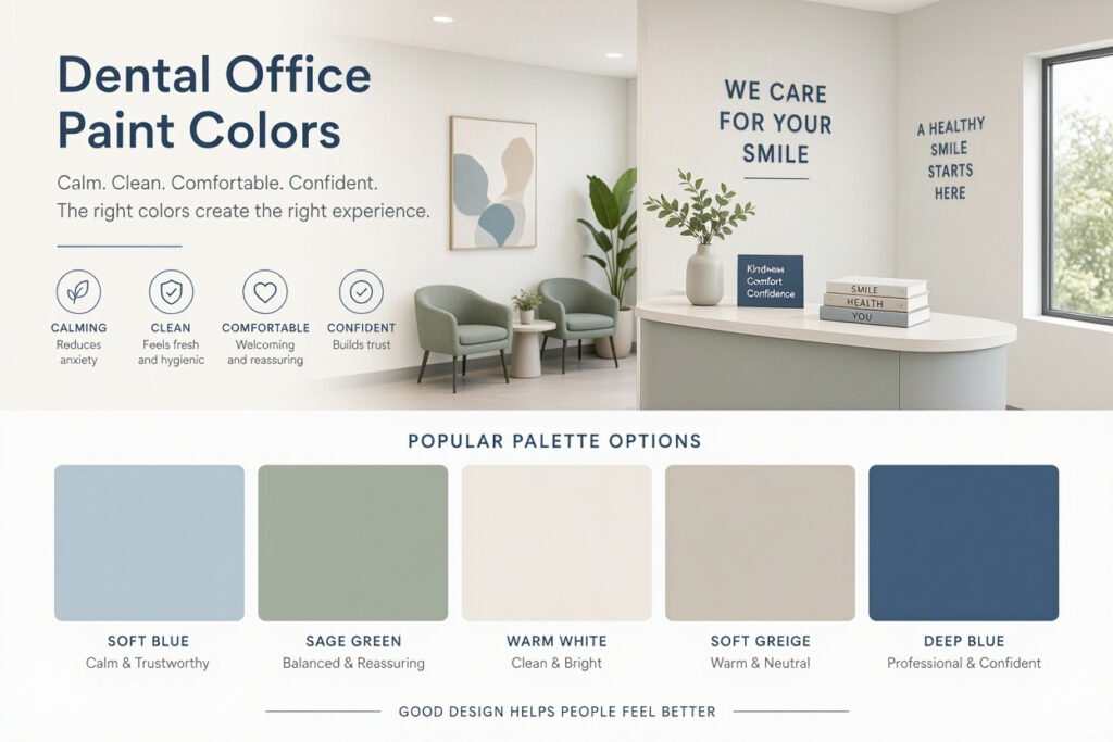
Why Paint Color Matters in a Dental Office
Paint color is more than decoration. It affects mood, perception, and behavior. Here is why it deserves careful consideration.
- It Reduces Anxiety: Soft, calming colors lower stress and help patients feel at ease. Harsh, bright colors have the opposite effect.
- It Builds Trust: Professional, harmonious colors signal competence and care. Chaotic or clashing colors raise doubts.
- It Improves Wayfinding: Color-coded walls help patients navigate your office. Consistent palettes create a sense of order.
- It Enhances Perceived Cleanliness: Light, fresh colors make spaces feel clean and hygienic. Dark or dingy colors feel dirty.
- It Boosts Team Morale: A pleasant environment lifts spirits. Staff who work in beautiful spaces are more engaged.
- It Reinforces Your Brand: Your paint colors should match your logo and marketing materials. Consistency builds recognition.
“Paint is the cheapest renovation you can make. For a few hundred dollars, you can completely change how your office feels. It is the highest-impact design decision in any dental practice.” — Dr. Amanda Reid, Dental Office Design Specialist
The Psychology of Color: What Each Shade Communicates
Different colors evoke different emotions. Understanding color psychology helps you choose shades that support your goals.
Blue
Blue is the most popular color for healthcare spaces. It promotes calm, trust, and professionalism. Light blues feel airy and fresh. Deep blues feel authoritative and sophisticated. Blue is ideal for reception areas, operatories, and hallways.
- Best For: Reception, operatories, hallways
- Avoid: Too much dark blue in small spaces
Green
Green is the color of nature, health, and renewal. It reduces stress and promotes a sense of well-being. Sage and mint greens are calming. Deep greens are sophisticated. Green is excellent for treatment rooms and waiting areas.
- Best For: Treatment rooms, waiting rooms, hallways
- Avoid: Bright lime greens that feel overstimulating
Beige and Warm Neutrals
Beige, cream, and soft taupe are warm and welcoming. They create a cozy, comfortable atmosphere. These colors are safe and versatile. They work well as base colors in any room.
- Best For: Waiting rooms, hallways, reception
- Avoid: Too much beige can feel boring without accent colors
Gray
Gray is modern, clean, and sophisticated. Light grays feel airy and professional. Charcoal grays feel dramatic and luxurious. Gray is a versatile neutral that pairs well with any accent color.
- Best For: Front office, reception, accent walls
- Avoid: Dark grays in small rooms without natural light
White
White is clean, bright, and clinical. It makes spaces feel larger and more hygienic. However, too much white feels cold and institutional. Use white as a base color and add warmth with accents.
- Best For: Ceilings, trim, operatories
- Avoid: All-white rooms without warm accents
Yellow
Yellow is cheerful and energetic. It boosts mood and promotes optimism. However, too much yellow can feel overwhelming and overstimulating. Use it sparingly as an accent color.
- Best For: Pediatric offices, accent walls
- Avoid: Large areas in adult-focused practices
Pink and Blush
Soft pinks and blush tones are warm, gentle, and soothing. They feel nurturing and comforting. These colors are excellent for pediatric offices and boutique practices.
- Best For: Pediatric offices, boutique practices
- Avoid: Bright pinks that feel overwhelming
| Color | Effect | Best Use | Avoid |
|---|---|---|---|
| Blue | Calm, trust, professional | Reception, operatories | Dark blue in small spaces |
| Green | Healing, natural, soothing | Treatment rooms, waiting | Bright lime greens |
| Beige | Warm, welcoming, cozy | Waiting rooms, hallways | All-beige without accents |
| Gray | Modern, clean, sophisticated | Front office, accents | Dark gray in dark rooms |
| White | Clean, bright, clinical | Ceilings, trim, operatories | All-white rooms |
| Yellow | Cheerful, energetic, optimistic | Pediatric offices, accents | Large areas |
| Pink | Gentle, nurturing, comforting | Pediatric, boutique | Bright pinks |
Note for Readers: Always test paint samples in your actual space before committing. Colors look different under different lighting conditions. A shade that looks perfect in the store may look completely different in your office.
Best Paint Colors for Each Room
Different areas of your practice have different needs. Here are the best colors for each space.
Reception and Waiting Room
The waiting room is where patients form their first impression. Choose warm, welcoming colors that reduce anxiety.
- Primary Walls: Soft beige, warm gray, or light blue
- Accent Wall: Deeper blue, sage green, or a branded color
- Trim and Ceiling: White or cream
- Why: These colors feel welcoming and professional. They set a calming tone for the visit.
Operatories and Treatment Rooms
Operatories need to be calm and clinical. Choose soft, neutral colors that do not interfere with clinical work.
- Primary Walls: Light blue, sage green, or warm white
- Ceiling: White or very light blue
- Accent Wall: Soft green or blue behind the patient chair
- Why: These colors reduce anxiety and support focus. They are calming without being distracting.
Hallways and Corridors
Hallways are transitional spaces. They should be calming and easy to navigate.
- Primary Walls: Warm gray, soft beige, or light green
- Accent Wall: A darker shade of the primary color
- Trim: White
- Why: These colors create a smooth flow between rooms. They feel cohesive and professional.
Front Office and Business Area
The front office is where your team works. Choose colors that support focus and comfort.
- Primary Walls: Light gray, soft blue, or warm white
- Accent Wall: A branded color or a deeper shade
- Trim: White
- Why: These colors are professional and calming. They reduce eye strain and support concentration.
Restrooms
Restrooms should be clean, fresh, and welcoming.
- Primary Walls: Light blue, soft green, or warm white
- Accent Wall: A fun, cheerful color
- Trim: White
- Why: These colors feel clean and hygienic. They add a pleasant surprise for patients.
| Room | Primary Wall Color | Accent Color | Trim |
|---|---|---|---|
| Reception | Soft beige or light blue | Deeper blue or sage green | White |
| Operatories | Light blue or sage green | Soft green or blue | White |
| Hallways | Warm gray or soft beige | Darker shade of primary | White |
| Front Office | Light gray or soft blue | Branded color | White |
| Restrooms | Light blue or soft green | Cheerful color | White |
Pro Tip: Use the 60-30-10 rule. Choose a dominant color (60%), a secondary color (30%), and an accent color (10%). This creates a balanced, harmonious look.
Choosing the Right Paint Finish
Paint finish affects durability, cleanability, and appearance. Dental offices have specific requirements.
1. Matte or Flat
- Best For: Ceilings, low-traffic areas
- Pros: Hides imperfections, soft appearance
- Cons: Difficult to clean, not durable
2. Eggshell
- Best For: Waiting rooms, reception areas
- Pros: Easy to clean, subtle sheen
- Cons: Shows some imperfections
3. Satin
- Best For: Hallways, front office
- Pros: Durable, easy to clean, slight shine
- Cons: Shows more imperfections than matte
4. Semi-Gloss
- Best For: Operatories, restrooms, trim
- Pros: Very durable, easy to clean, moisture-resistant
- Cons: Shows imperfections, can look shiny
5. High-Gloss
- Best For: Trim, doors, accents
- Pros: Extremely durable, easy to clean
- Cons: Shows every imperfection, can look clinical
| Finish | Best Use | Cleanability | Durability |
|---|---|---|---|
| Matte | Ceilings | Low | Low |
| Eggshell | Waiting rooms | Medium | Medium |
| Satin | Hallways, offices | High | High |
| Semi-Gloss | Operatories, restrooms | Very High | Very High |
| High-Gloss | Trim, doors | Very High | Very High |
Important Note: Use semi-gloss or high-gloss paint in operatories and restrooms. These areas require frequent cleaning and disinfection. Matte and eggshell finishes are not suitable for clinical spaces.
Low-VOC and Eco-Friendly Paints
Indoor air quality matters in a dental office. Patients and staff spend hours in your space. Choose paints that are safe and environmentally friendly.
What Are VOCs?
VOCs (volatile organic compounds) are chemicals that release harmful gases into the air. Traditional paints contain high levels of VOCs. These can cause headaches, nausea, and respiratory issues.
Benefits of Low-VOC Paints
- Better Air Quality: Low-VOC paints release fewer harmful chemicals.
- Safer for Sensitive Patients: Patients with allergies or asthma benefit from cleaner air.
- Environmentally Friendly: Low-VOC paints have a smaller environmental footprint.
- Less Odor: Low-VOC paints have minimal smell, allowing you to use rooms sooner.
Tips for Choosing Low-VOC Paint
- Look for Certification: Choose paints certified by GREENGUARD or similar organizations.
- Check VOC Levels: Aim for paints with VOC levels below 50 g/L.
- Ask About Pigments: Some pigments contain VOCs. Ask your supplier for low-VOC colorants.
- Ventilate During Painting: Even low-VOC paints benefit from good ventilation during application.
Note for Readers: Always allow adequate drying time before using painted rooms. Follow the manufacturer’s instructions for curing and ventilation.
Common Paint Color Mistakes to Avoid
Even well-intentioned color choices can go wrong. Here are the most common mistakes.
- Choosing Colors in the Store: Always test samples in your actual space. Lighting changes everything.
- Ignoring Lighting: A color that looks warm in natural light may look cold under fluorescent lights. Test under your office lighting.
- Too Many Colors: Using too many different colors creates a chaotic look. Stick to a cohesive palette.
- Forgetting the Ceiling: The ceiling is part of your color scheme. Paint it white or a very light shade to keep the room feeling open.
- Neglecting Trim: Trim color matters. White trim is classic and clean. Colored trim can add personality but requires careful coordination.
- Skipping Primer: Primer affects the final color. Use a high-quality primer for accurate results.
- Not Testing Durability: Some colors show scuffs and marks more than others. Choose durable finishes in high-traffic areas.
“The most common mistake I see is choosing a color based on a tiny swatch. Paint a large sample board and live with it for a few days. See how it looks in morning light, afternoon light, and under your office lights. Only then should you commit.” — Sarah Mitchell, Healthcare Interior Designer
How to Test Paint Colors
Testing is essential. Here is a simple process.
- Choose Your Shortlist: Select three to five colors you are considering.
- Buy Sample Pots: Purchase small sample pots of each color.
- Paint Sample Boards: Paint large boards (at least 2 feet by 2 feet) with each color. Label them.
- Place in the Room: Position the boards in different areas of the room. See how they look on different walls.
- Observe at Different Times: Check the colors in morning, afternoon, and evening light. Also check under your office lighting.
- Get Feedback: Ask team members and patients for their opinions. Fresh eyes see things you might miss.
- Make Your Choice: Choose the color that looks best in all conditions.
Pro Tip: Paint samples directly on the wall if possible. This gives the most accurate representation. If you cannot paint on the wall, use large boards and move them around the room.
Budgeting for Dental Office Painting
Painting is one of the most affordable renovations. Here is a simple budgeting framework.
| Item | Cost Range | Notes |
|---|---|---|
| Paint (per gallon) | $30 – $70 | Quality paint costs more but lasts longer |
| Primer (per gallon) | $20 – $40 | Essential for proper adhesion and color |
| Supplies (brushes, rollers, tape) | $50 – $150 | Invest in quality tools |
| Professional Painter | $2 – $5 per square foot | Recommended for large jobs |
| DIY Painting | $200 – $500 total | Labor-intensive but cost-effective |
Pro Tip: If you hire a professional, get at least three quotes. Ask for references and check their work. A good painter will prepare surfaces properly and use quality materials.
Frequently Asked Questions
What is the best paint color for a dental office?
Soft blue, sage green, warm beige, and light gray are the best choices. They are calming, professional, and reduce anxiety. Avoid bright colors and dark shades in clinical areas.
What paint finish is best for dental operatories?
Semi-gloss or high-gloss finishes are best. They are durable, easy to clean, and resist moisture and disinfectants. Avoid matte finishes in clinical areas.
Are low-VOC paints worth the extra cost?
Yes. Low-VOC paints improve indoor air quality and are safer for patients and staff. They also have less odor, allowing you to use rooms sooner after painting.
How often should I repaint my dental office?
Every three to five years, depending on traffic and wear. High-traffic areas like hallways and reception may need more frequent touch-ups. Operatories may need repainting more often due to frequent cleaning.
Should I paint my ceiling?
Yes. Paint ceilings white or a very light shade. This keeps the room feeling open and bright. Avoid dark colors on ceilings, which can feel heavy and oppressive.
Can I use the same color throughout my entire office?
Yes, but add variety with accent walls and different finishes. A monochromatic palette can look elegant if done well. Use texture and lighting to add interest.
Conclusion
Choosing the right paint colors for your dental office is a strategic investment in patient comfort and practice success. By understanding color psychology, testing samples carefully, and selecting the right finishes for each area, you can create a space that feels calm, professional, and welcoming.
Additional Resource
For more inspiration on color trends and palettes, explore the resources from the Pantone Color Institute. https://www.pantone.com/color-intelligence