Dental Office Wall Art: A Practical Planning and Installation Guide
Wall art in a dental office either works as a system or fails as a collection of random frames. The difference isn’t budget—it’s planning. Practices that map out what goes on each wall, at what size, and in what style end up with rooms that feel calm and intentional. Practices that buy pieces one at a time end up with walls that feel cluttered, even when the individual artworks are nice.
This guide treats wall art as a planning problem. You’ll learn how to size pieces for specific walls, choose hanging systems that survive a clinical environment, maintain visual flow from room to room, and refresh the collection over time. For sourcing artists and budgeting, our article on dental office art covers those decisions in depth.
Start With a Wall Art Plan
Before buying anything, walk through your office and list every wall that patients see. Then assign each wall a role.
| Wall Location | Role | Recommended Approach |
|---|---|---|
| Behind reception | Brand anchor | Logo signage or one large branded piece. |
| Waiting area main wall | Focal point | One large statement piece or a tight gallery arrangement. |
| Waiting area secondary walls | Support | Two or three related pieces in the same style. |
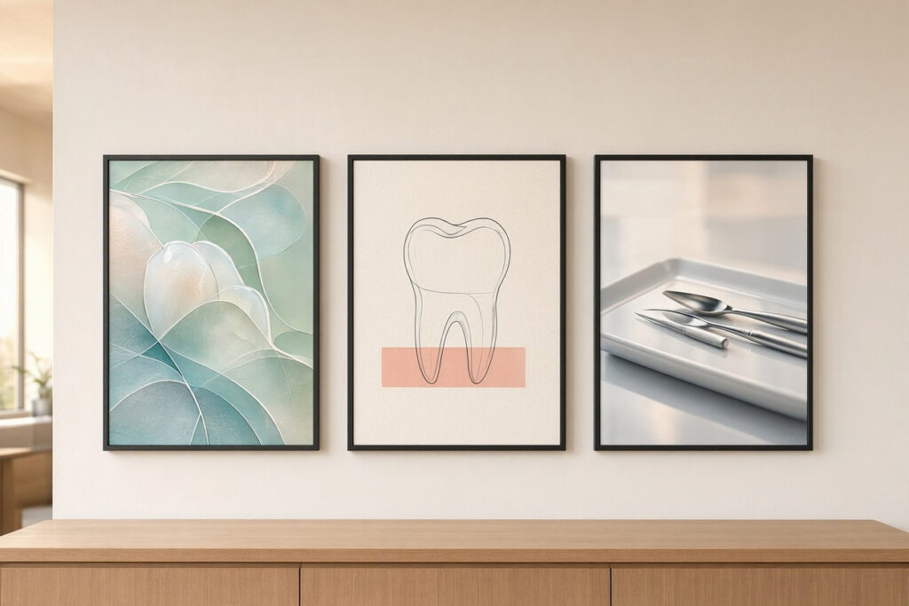
| Corridor walls | Flow and wayfinding | A series of matched prints leading toward treatment rooms. |
| Treatment room walls | Distraction and calm | One or two simple pieces, nothing busy. |
| Treatment room ceiling | Primary patient view | A dedicated ceiling piece or panel. |
| Restroom walls | Small accent | A single small print or mirror. |
A written plan prevents duplicate purchases and impulse buys. It also makes it obvious when a wall is better left blank—blank is often better than crowded.
Sizing Art for Real Walls
The most common wall art mistake is buying pieces that are too small. A small frame floating on a large wall looks lost and makes the room feel unfinished.
Practical Sizing Rules
| Wall Type | Artwork Width Rule | Example |
|---|---|---|
| Above a sofa or bench | 60–75% of furniture width | 72-inch sofa → art 45–54 inches wide. |
| Above a row of waiting chairs | 50–70% of the seating run | 60-inch seating run → art 30–42 inches wide. |
| On an empty feature wall | 60–75% of wall width | 10-foot wall → art 6–7.5 feet wide (or a grouped arrangement). |
| In a narrow corridor | Repeat smaller pieces | A series of same-size prints spaced evenly. |
| Above a reception desk | Centered, 40–60% of desk width | Signage or one large piece, hung 6–10 inches above the counter. |
Height Guidelines
- Standing eye level: Center art at 57–60 inches from the floor.
- Above furniture: Hang 6–10 inches above the top of the sofa, bench, or desk.
- Seated viewing areas: Lower to roughly 54 inches so reclined or seated patients can see comfortably.
- Treatment room ceilings: Position where a reclined patient looks naturally—usually directly above or slightly behind the chair.
“We measured every wall and marked hanging heights with painter’s tape before buying a single frame. It felt fussy at the time, but it saved us from returning half our purchases.” — Nora Whitfield, Dental Office Manager
Hanging Systems That Survive a Clinical Environment
Standard picture hooks are fine at home. A dental office needs hardware that holds up to cleaning, humidity, and traffic.
| Hanging System | Best For | Pros | Cons |
|---|---|---|---|
| French cleat | Large, heavy pieces | Very secure, distributes weight | Requires level installation |
| Z-bar / interlocking bracket | Medium to large frames | Flush against wall, sturdy | Less adjustability after mounting |
| D-ring with wall anchors | Standard frames | Simple, widely used | Must match anchor to wall type |
| Picture rail system | Corridors with rotating art | Easy to change pieces without new holes | Visible hardware, less common in commercial spaces |
| Security hangers | High-traffic or unsupervised areas | Locking, tamper-resistant | Higher cost, more complex |
| Adhesive strips | Very light pieces only | No holes | Not reliable for heavy or framed pieces |
Installation Notes
- Use anchors rated well above the piece’s weight.
- Avoid hanging heavy frames above patient seating or treatment chairs—choose ceiling-mounted or wall-mounted flat panels in those spots instead.
- In humid areas near sterilization rooms, prefer canvas or acrylic panels over glass-framed pieces.
- Keep frames out of the direct spray zone of cleaning products where possible.
Creating Visual Flow Between Rooms
Patients walk a path through your office: entrance, waiting area, corridor, treatment room. Wall art should feel connected along that path, not like it belongs to different buildings.
Consistency Tools
- Repeat a style: All nature photography, all botanical prints, or all soft abstracts—pick one.
- Repeat a frame: Identical frame style and color throughout creates cohesion cheaply.
- Repeat a size: A series of same-size pieces reads as intentional.
- Repeat a color: Pull two or three accent colors from your palette into the artwork.
- Vary scale, not style: Large pieces in big spaces, small pieces in corridors—same visual language.
Where to Break the Pattern
Treatment rooms can be simpler than waiting areas. Children’s corners can be more playful. Restrooms can carry a single quirky piece. The connective thread is color and frame style, not identical subject matter.
Wall Art Themes That Work, Room by Room
| Theme | Waiting Area | Corridor | Treatment Room | Children’s Area |
|---|---|---|---|---|
| Local landscapes | Large statement print | Series of small prints | One soft image | Local animals or landmarks |
| Botanical | Grouped prints | Matched series | Single close-up | Friendly plant illustrations |
| Coastal | Wide seascape | Three-part series | Calm water image | Beach-themed cartoons |
| Abstract calm | Large canvas | Two paired pieces | Single soft piece | Colorful shapes |
| Friendly illustration | One or two accents | Storybook series | Gentle cartoon | Main feature |
Rotation and Refresh Strategy
Walls go stale. A collection that looked fresh at opening can feel dated within three years. Plan rotation from the start.
A Simple Rotation Calendar
- Quarterly: Swap seasonal pieces in the waiting area—spring botanicals, autumn tones, tasteful winter decor.
- Annually: Rotate one corridor series to a new theme.
- Every two to three years: Review the whole collection. Retire faded, damaged, or outdated pieces.
- Ongoing: Add one new piece per year from a local artist to keep the collection evolving.
Storage and Inventory
Keep a written inventory with photos, dimensions, and purchase dates. Store off-season pieces flat, wrapped, and away from moisture. Label boxes clearly so rotation doesn’t become a search.
Budget-Friendly Wall Art Strategies
You don’t need to fill every wall on day one. Wall art is one of the easiest elements to build gradually.
- Prioritize the waiting area and the wall patients stare at most. Other walls can wait.
- Buy in sets. Matched prints cost less per piece and create instant cohesion.
- Use one large piece instead of many small ones. Large prints and canvases are often cheaper per square foot of impact.
- Frame simply. Uniform, inexpensive frames in one style look more professional than varied ornate ones.
- Print your own photography of local scenery at high resolution.
- Rotate rather than replace. Move existing pieces to new walls before buying more.
Common Wall Art Mistakes to Avoid
| Mistake | Why It’s a Problem | Better Approach |
|---|---|---|
| Art too small for the wall | Makes rooms feel unfinished | Follow the 60–75% sizing rule |
| Hanging too high | Disconnects art from furniture and viewers | Center at seated or standing eye level |
| Mismatched frames everywhere | Looks unplanned | Standardize frame style and color |
| Dark or busy imagery in treatment rooms | Increases rather than reduces anxiety | Use calm, simple imagery |
| Glass frames above patient chairs | Breakage risk | Use acrylic or canvas in clinical areas |
| No rotation plan | Collection goes stale | Schedule seasonal and annual refreshes |
| Cluttering every wall | Visual noise | Leave some walls intentionally blank |
An FAQ on Dental Office Wall Art
1. How big should wall art be in a dental waiting area?
Aim for a piece or arrangement that spans 60–75% of the width of the furniture beneath it. On a large empty wall, a single piece or grouped arrangement should cover at least 60% of the wall width to avoid looking lost.
2. What is the best height to hang wall art in a dental office?
Center art at 57–60 inches from the floor where people stand. In areas where patients sit or recline, lower it to around 54 inches so it’s visible from a seated position.
3. What hanging hardware works best in a dental office?
French cleats and Z-bar brackets are the most secure for large frames. Standard D-rings with appropriate wall anchors work for lighter pieces. Avoid adhesive strips for anything heavier than a light poster.
4. How do I keep wall art consistent across different rooms?
Standardize frame style, color, and size, and repeat one or two accent colors throughout. Vary the scale and subject slightly by room, but keep the overall visual language the same.
5. How often should dental office wall art be changed?
Rotate seasonal pieces quarterly, refresh one area annually, and review the full collection every two to three years. Replace anything faded, damaged, or no longer matching your brand.
6. Is it safe to hang glass-framed art in treatment rooms?
It’s better to use acrylic glazing or canvas in treatment rooms. Glass poses a breakage risk near patients. Secure all frames with anchors rated for the weight and avoid hanging heavy pieces above the dental chair.
7. How can I build a wall art collection on a tight budget?
Start with the waiting area and the wall patients look at most. Buy matched sets, choose simple uniform frames, use high-resolution prints of your own photography, and rotate existing pieces before buying new ones.
Important Note for Readers
Confirm wall construction before hanging anything, and use anchors rated for the weight of each piece. Avoid hanging heavy frames above seating or treatment chairs. In humid areas, choose canvas or acrylic over glass. If you rent your space, check your lease before making holes in the walls.
Conclusion
Dental office wall art works best when it’s planned as a system rather than assembled piece by piece.
Sizing art correctly and hanging at proper heights makes every wall feel intentional.
Consistent frames, colors, and themes create calm visual flow from room to room.
A simple rotation plan keeps the collection fresh for years without constant spending.
Additional Resource: For guidance on visual arts in healthcare settings, visit the Arts & Health Alliance. https://www.artsandhealthalliance.org/